
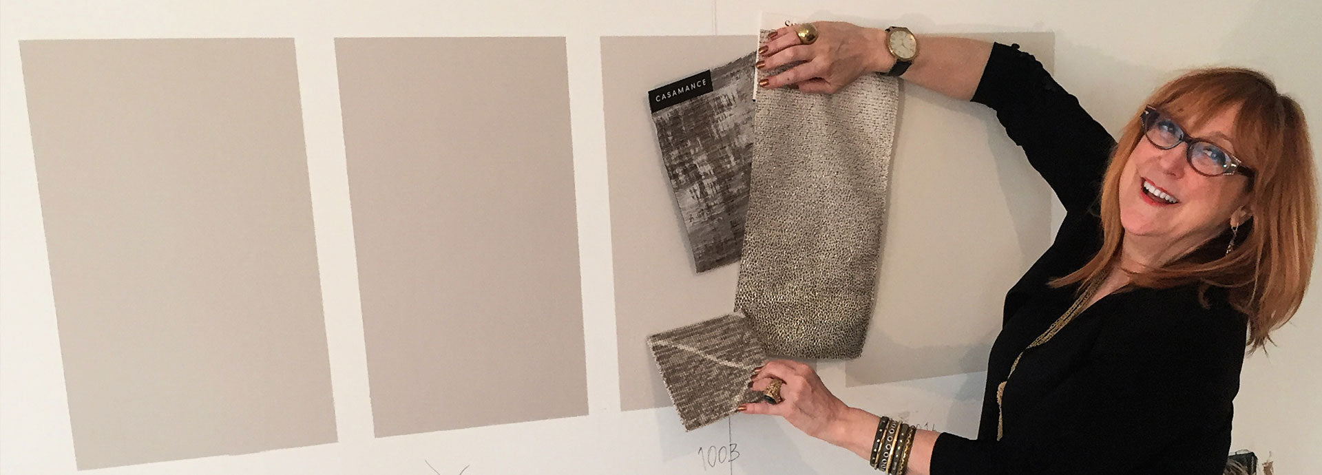
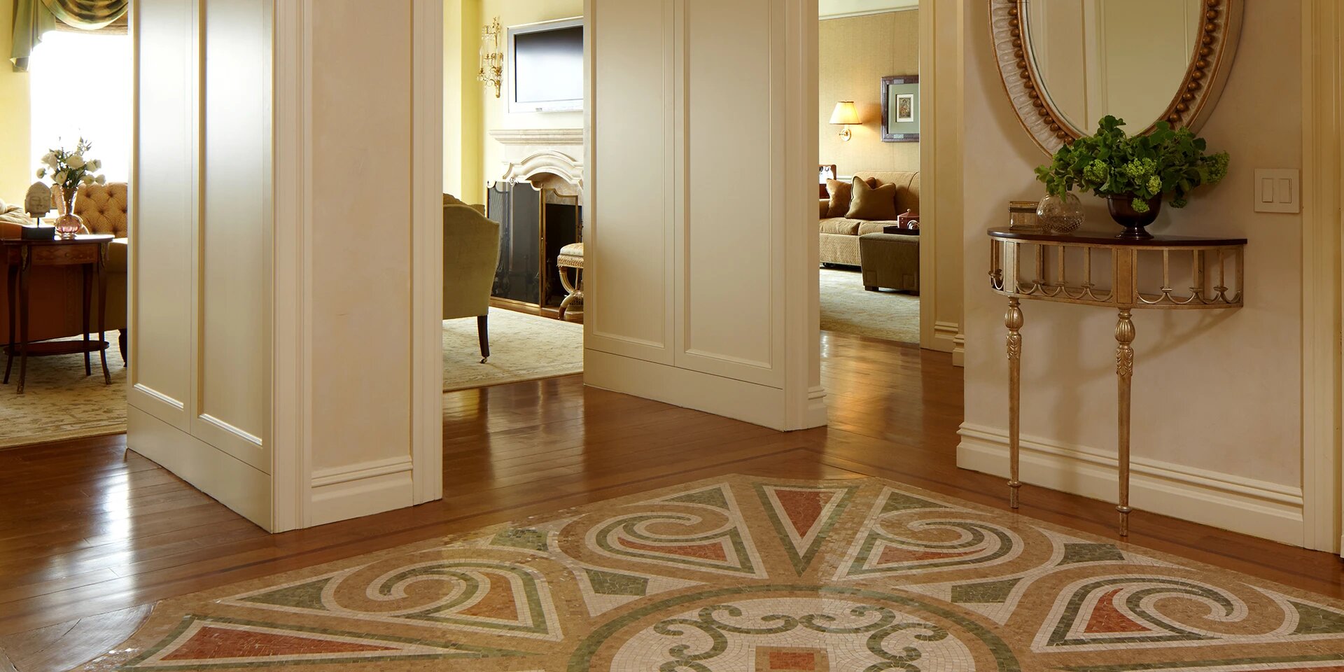
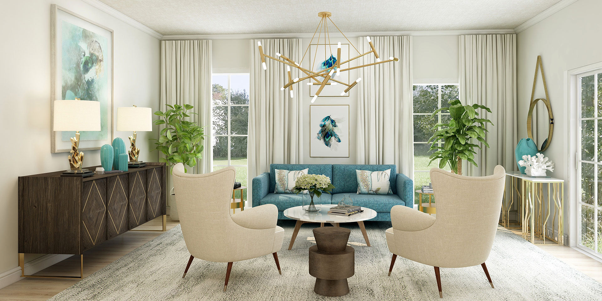
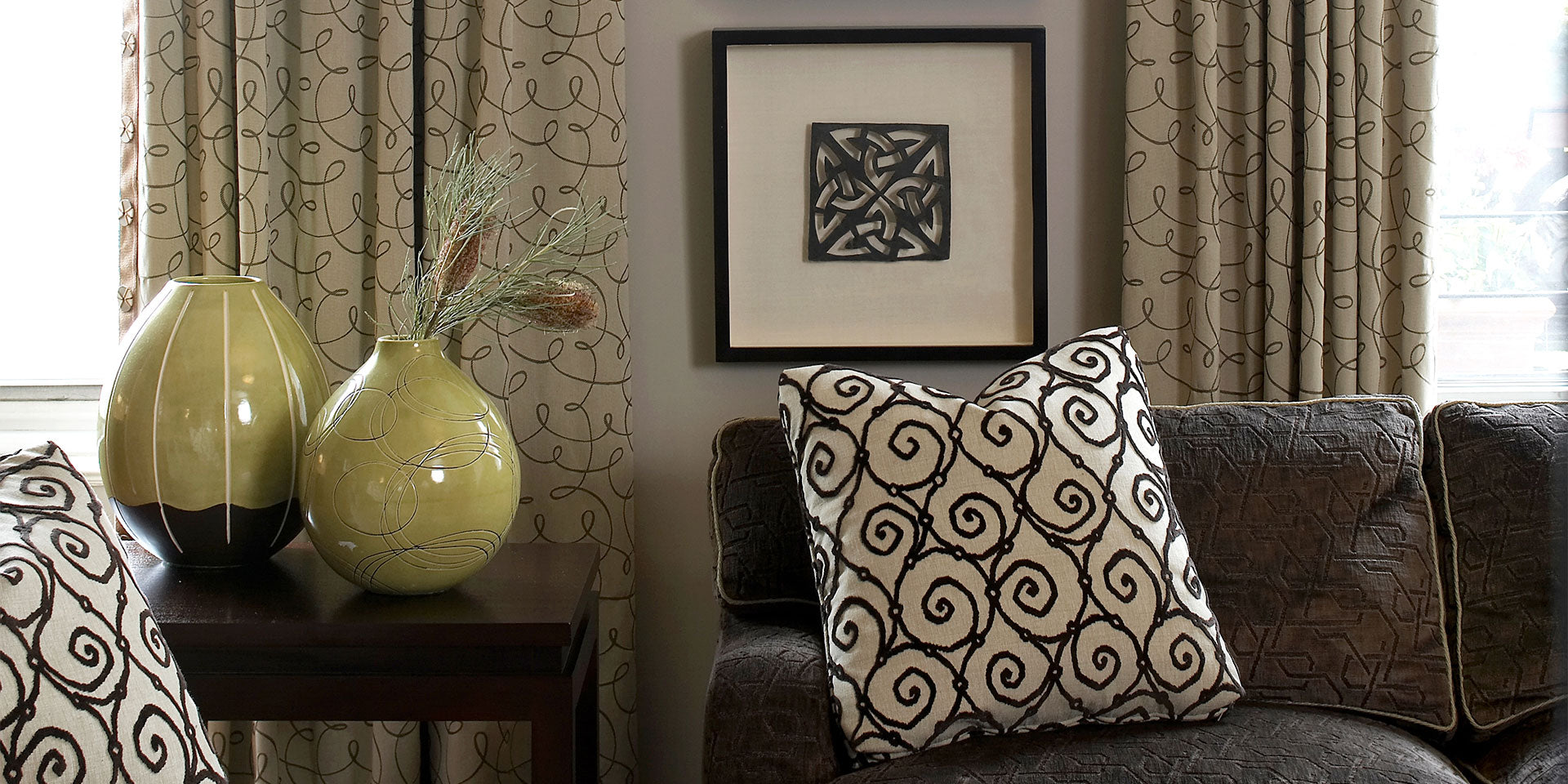
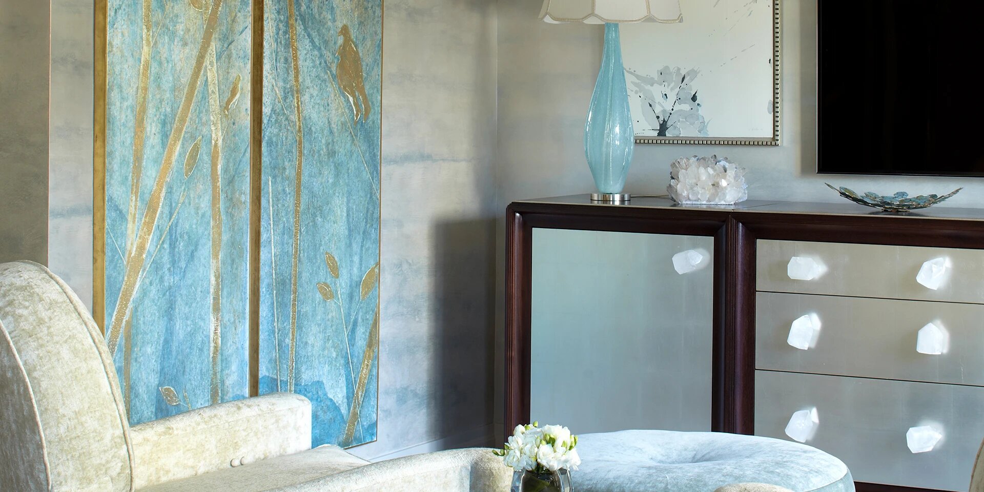
Color Ways - Tan
Finding a color story that appeals to you is the first step in designing a space that will welcome you home each time you open your door. Color is powerful and fascinating. It influences our moods, evokes emotion, and sets the tone for our surroundings.
To help you on your color journey, Robin has put together these inspiring Color Ways just for you using exclusively Sherwin-Williams paint colors. Each palette will help you visualize colors together, and you can compare them to find the color ways you’re drawn to.
Remember, a color palette can change your mood, uplift your spirit, and inspire you—so pay close attention to how you are responding to each color way. Your first instinct matters. After all, Confidence Begins at Home!
No color pellets are available for this color family
Bold Navy Palette
White, and gray mix to modernize the classic navy color. Navy is a striking color that conveys confidence and intelligence, while white celebrates new beginnings and grays balance your surroundings.
SW 7757
High Reflective White
SW 9166
Drift of Mist
SW 7651
Front Porch
SW 7657
Tinsmith
SW 6241
Aleutian
SW 9178
In the Navy
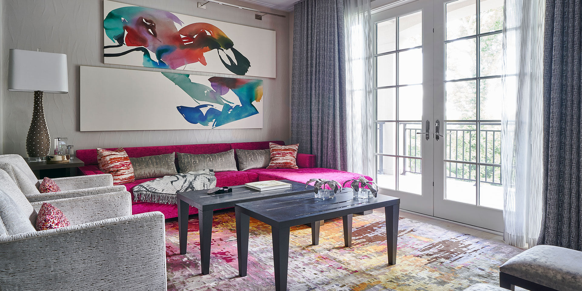
Confident Fuchsia Palette
This vivid mix of fuchsia and purple adds just the right pop to the neutral palette. Fuchsia adds an air of assurance to any space. Deep tones of purple evoke a feeling of elegance and royalty, and the silvery gray is a color of strength.
SW 7007
Ceiling Bright White
SW 7654
Lattice
SW 7649
Silverplate
SW 6003
Proper Gray
SW 6550
Mythical
SW 6840
Exuberant Pink
Gold Glow Palette
A cozy combination grounded by soft, calming golden neutral tones, with white to brighten spaces and deep warm highlights for an earthy pop. The golden, sun-kissed tans symbolize security and evoke stability.
SW 6397
Nankeen
SW 7527
Nantucket Dune
SW 7562
Roman Column
SW 6156
Ramie
SW 6386
Napery
SW 7757
High Reflective White
Tranquil Teal Palette
A restful, calming combination with grounding grays, bright whites, and teal for cheerful contrast. Teal revitalizes the mood and promotes free-flowing conversation.
SW 6471
Hazel
SW 6487
Cloudburst
SW 9541
White Snow
SW 6385
Dover White
SW 7728
Green Sprout
SW 7634
Pediment
Rich Gold Palette
An elevated combination of warm neutrals, candlelit creams, and rich, glowing gold. Bold tones contrast with dark definition. The color gold promotes compassion, courage, and wisdom.
SW 6148
Wool Skein
SW 7005
Pure White
SW 7106
Honied White
SW 7681
Tea Light
SW 2920
Monarch Gold
SW 2926
Iron Gate
Soft Violet Palette
A luxe mix featuring passionate purple-pinks, grounded by violet-tinged grays for soft sophistication. Violet evokes feelings of creativity, dignity, and devotion.
SW 6290
Rose
SW 6288
Rosebud
SW 7667
Zircon
SW 6291
Moss Rose
SW 6072
Versatile Gray
SW 7005
Pure White
Rosy Taupe Palette
Soft grounding taupes and a blush of petal-perfect pink come together with calming elegance. Pink represents playful charm, tenderness, and love.
SW 6303
Rose Colored
SW 9541
White Snow
SW 9576
Whirlwind
SW 9588
High Sierra
SW 9169
Chatura Gray
SW 7108
Pink Vibernum
Elevated Earth Tones Palette
Soft, sagey greens and grays contrast with warm rusts and golds. Resonant whites brighten beautifully. The combination feels warm, welcoming, and relaxed in colors known to evoke emotional balance.
SW 6326
Henna Shade
SW 7566
Westhighland White
SW 6185
Escape Gray
SW 7694
Dromedary Camel
SW 9541
White Snow
SW 6186
Dried Thyme
Simply Sand Palette
A clean, monochromatic combination infused with warmth. Rich whites create a clean canvas for sandy shades, which will help you feel grounded in your space. Tan colors evoke a sense of familiar, unchanging stability.
SW 7688
Sundew
SW 6135
Ecru
SW 7519
Mexican Sand
SW 7005
Pure White
SW 7637
Oyster White
SW 7105
Paperwhite
Bold Turquoise Palette
This vibrant palette combines energized lime with a pop of punchy teal. Grounded by complimentary grays, the feeling is forward-looking and hopeful. Vibrant lime green is associated with confidence and nature, while teal promotes clarity of thought.
SW 7757
High Reflective White
SW 6036
Angora
SW 6717
Lime Rickey
SW 9691
Crystalline
SW 6780
Nautilus
SW 6038
Truly Taupe
Moody Silver Palette
Soft versions of black and dark brown, together with rich silver tones, make up this bold palette. The effect is modern, dramatic, and defined. Bold browns symbolize strength and reliability.
SW 9580
Cracked Pepper
SW 6002
Essential Gray
SW 6001
Grayish
SW 9541
White Snow
SW 6258
Tricorn Black
SW 6000
Snowfall
Serene Aqua Palette
Complex shades of blue-green teals evoke a sense of calm. Creams feel clean and upbeat. Teals are known to evoke feelings of reinvigoration and youth.
SW 6462
Green Trance
SW 6488
Grand Canal
SW 6766
Mariner
SW 7005
Pure White
SW 6385
Dover White
SW 7570
Egret White
Muted Earthy Palette
Interesting browns, rusts, and taupes combine to create a comfortable and inviting atmosphere. Warm taupes like these represent timeless sophistication, and can promote intelligence and dignity.
SW 9006
Rojo Dust
SW 6039
Poised Taupe
SW 7715
Pottery Urn
SW 7757
High Reflective White
SW 9160
Armadillo
SW 7082
Stunning Shade
Vibrant Coral Palette
Energetic, cheerful corals are grounded by contrasting neutral brown tones. Coral has the power to invigorate, as it blends the passion of pink with the optimism of orange.
SW 6904
Gusto Gold
SW 6613
Lei Flower
SW 6592
Grenadine
SW 7063
Nebulous White
SW 7658
Gray Clouds
SW 7048
Urbane Bronze
Steely Gray Palette
Grays with purple undertones feel warm and rich when popped with confident red. Crisp white maximizes the clean contrast. Grays add timelessness and balance, while red symbolizes passion, power, and high energy.
SW 6017
Intuitive
SW 6005
Mink
SW 7505
Manor House
SW 7006
Extra White
SW 6861
Radish
SW 6001
Grayish
Spiced Earth Palette
An eclectic mix of warm grays, deep blacks, and cinnamon-tinged browns. Much like the earth itself, this palette evokes feelings of resilience, strength, and reliability.
SW 9600
Armory
SW 7006
Extra White
SW 9160
Armadillo
SW 6186
Moderne White
SW 7702
Spiced Cidar
SW 9574
Hulett Ore
Warm Gray Palette
Cozy grays, bright whites, and soft purples are energized by a playful punch of pink. Gray evokes fairness and peace, while vibrant pink symbolizes vitality and passion.
SW 9574
Hulett Ore
SW 7006
Extra White
SW 6840
Exuberant Pink
SW 6168
Moderne White
SW 7072
Online
SW 6550
Mythical
Cool Gray Palette
Steely grays and sweet plums elevate the calming gray tones, which ground the space. Cooler grays bring a sense of serenity, while regal plum evokes ambition.
SW 7072
Online
SW 7075
Web Gray
SW 7029
Agreeable Gray
SW 7004
Snowbound
SW 6001
Grayish
SW 6284
Plum Dandy
Refined Orange Palette
Energized oranges come down to earth with help from grounding grays and bright whites. Orange boosts creativity and determination, while grays bring balance and practicality.
SW 6885
Knockout Orange
SW 6881
Cayenne
SW 7066
Gray Matters
SW 7005
Pure White
SW 7674
Peppercorn
SW 9541
White Snow
Icy Taupe Palette
Serene and sophisticated blue livens up a palette defined by touches of taupe and bright, modern whites. Blue is known to make us feel imaginative, inspired, and faithful.
SW 9144
Moonmist
SW 6507
Resolute Blue
SW 7634
Pediment
SW 7006
Extra White
SW 7666
Fleur de Sel
SW 6004
Mink
Soothing Lavender Palette
Versatile cool grays ground this color story that celebrates shades of lavender. Surrounding ourselves with purple can bring feelings of devotion, power, and ambition.
SW 6556
Old Lilac
SW 9546
Lunar Lite
SW 6821
Potentially Purple
SW 7006
Extra White
SW 6820
Inspired Lilac
SW 6268
Veiled Violet
Soft Sage Palette
Neutrals leaning green and blue ground the space while bringing in the essence of nature. Greens evoke harmony, freshness, and growth, while blues can inspire sincerity and confidence.
SW 7001
Marshmallow
SW 7006
Extra White
SW 6163
Grassland
SW 6415
Hearts of Palm
SW 0068
Copen Blue
SW 7058
Magnetic Gray
Rich Gray Palette
Warm, taupey grays and deep leathery browns feel refined and sophisticated. Brown brings a sense of safety and natural earthiness, while gray grounds with calm, quiet balance.
SW 7642
Pavestone
SW 7715
Pottery Urn
SW 9562
Fortitude
SW 7005
Pure White
SW 6231
Rock Candy
SW 9574
Hulett Ore
Rich Brown Palette
Deep browns and nature-inspired greens feel fresh paired with clean, bright white. Green promotes a sense of growth, and brown celebrates a feeling of reliable familiarity.
SW 7515
Homestead Brown
SW 6158
Sawdust
SW 7634
Pediment
SW 7005
Pure White
SW 6417
Tupedo Tree
SW 7048
Urbane Bronze
Strong Neutrals Palette
Creamy whites are elevated by rich browns and a hint of historic blue. Blues bring a sense of inspiration and evoke sea and sky, while browns ground with stability and earthiness.
SW 6158
Sawdust
SW 7515
Homestead Brown
SW 6385
Dover White
SW 7005
Pure White
SW 6248
Jubilee
SW 7048
Urbane Bronze
Warm Taupe Palette
This monochromatic color story feels comforting and calming with whites paired with light browns and grays. Whites infuse spaces with a feeling of purity and goodness, while taupes add a hint of dignity.
SW 7511
Bungalow Beige
SW 7005
Pure White
SW 9160
Armadillo
SW 9541
White Snow
SW 7658
Gray Clouds
SW 7634
Pediment
Sunny Saffron Palette
Yellow infuses spaces with sunny optimism, with orange-red and sage-green accents to further boost the mood. Reds make us feel energized and alive, while calming greens put us in touch with the natural world.
SW 6622
Hearty Orange
SW 7561
Lemon Meringue
SW 6385
Dover White
SW 1666
Venetian Yellow
SW 7726
Lemon Verbena
SW 9541
White Snow
Fabulous Fuchsia Palette
A meant-to-be-seen shade of fuchsia plays off reserved whites and grays, with pops of teal and turquoise to complete the statement. Turquoise makes us feel balanced emotionally, while vibrant pinks play to our passions.
SW 6843
Hot
SW 6249
Storm Cloud
SW 6783
Amalfi
SW 7757
High Reflective White
SW 6487
Cloudburst
SW 7653
Silverpointe
Gilded Gold Palette
Variations of deep golds strengthen each other, with moments of teal and white to enhance the sophistication. Surrounding ourselves with gold can make us feel triumphant, as it implies prestige, and prosperity.
SW 6390
Bosc Pear
SW 6139
Mossy Gold
SW 6388
Golden Fleece
SW 9541
White Snow
SW 6479
Drizzle
SW 7515
Homestead Brown
Daring Dijon Palette
Golds mingle with soft blue and gray in this sophisticated palette that feels calming, yet luxe. Yellow can bring a sense of happiness to a space, while blues keep us calm and collected.
SW 9148
Smoky Azurite
SW 7653
Silverpointe
SW 6697
Nugget
SW 9574
Hulett Ore
SW 7562
Roman Column
SW 6694
Glad Yellow
Relaxed Blue Palette
Approachable shades of blue mix with warm creams and barely-there gray. Blue can bring the essence of trust, intelligence, and peace into a space.
SW 6806
Rhythmic Blue
SW 6505
Vast Sky
SW 7606
Blue Cruise
SW 7757
High Reflective White
SW 7666
Fleur de Sel
SW 9541
White Snow
Shades of Gray Palette
Shadowy grays contrast with lighter shades and bright whites, with silver to ground the look. Silvery tones can make us feel glamorous and prosperous, and can enhance intuition.
SW 7072
Outline
SW 7075
Web Gray
SW 7074
Software
SW 7757
High Reflective White
SW 7653
Silverpointe
SW 7005
Pure White
Rejuvenating Blue Palette
Aqua-infused blues mingle with crisp, clean whites and light sagey taupes to ground the space. Aqua can make us feel refreshed, youthful, and dreamy.
SW 6492
Jetstream
SW 6493
Ebbtide
SW 7757
High Reflective White
SW 7005
Pure White
SW 7666
Fleur de Sel
SW 6941
Open Air
Enthusiastic Yellow Palette
Cheerful yellow works well with the versions of gray, from light to dark. Yellow can evoke feelings of happiness, while deep grays can evoke elegance and formality.
SW 7645
Thunder Gray
SW 7673
Pewter Cast
SW 1667
Icy Lemonade
SW 7672
Knitting Needles
SW 7008
Alabaster
SW 7757
High Reflective White

Custom design by Robin Baron Design Inc. Click here for Design Services.