Dear Fabulistas!
Its a colorful time of year, especially with brands announcing their color of the year. It’s one of my favorite times because I get to share how you can integrate the new trend colors into your homes and your holiday entertaining. I know thinking about the latest and greatest trends for your home can be confusing… after all, you want to express yourself, but not be too trendy. Being on trend, though, has nothing to do with being trendy. We’re not talking fads here, we’re talking about opening your horizons and thinking in new, fresh ways. You have a plethora of options and my job is to help you make sense of all this!
You can introduce any of these colors in larger or smaller scales in your home. You can ?make a statement with one color, tones and shades of a color, mix them up or simply add a little touch with a feature wall or accessories. It’s all about what inspires you and makes you feel confident at home!
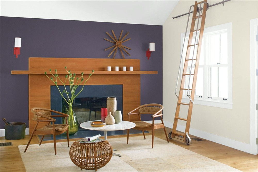
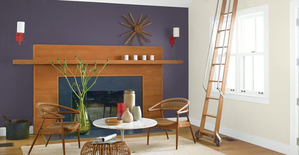
Benjamin Moores color of the year is Shadow 2117-30… it’s ?a sumptuous, deep amethyst. It’s gorgeous! It feels new and can make architectural elements in your home, like wood trim, mouldings and mantels, truly pop. This color can highlight everything surrounding it allowing you to see the room in a new way. You can also ?make a statement by offsetting it with whites and lots of light. This contrast creates a big impact!

Image courtesy Benjamin Moore

Image courtesy The Editor At Large of Robin Baron’s tabletop vignette from Bilotta Kitchen’s Art of the Table

Image courtesy Pinterest
Taupe tones are one of my favorite neutrals, so I’m excited about Sherwin Williams color of the year, Poised Taupe! It’s a grey that’s been warmed up by adding a woodsy brown tone.? The result is an organic neutral that’s simply beautiful on your walls. It’s versatility can be seen in the photos below. When combined with a black-and-white story, it does its magic by making a more formal classic black-n-white look, feel cozy and chic. It’s easy to make your own personal statement when using a rich neutral like this as your backdrop, so don’t be shy, take a chance and express yourself!


Images courtesy Sherwin Williams
The queen of colors, Pantone, has yet to reveal their color of the year. We? have to wait a few more weeks for them to announce their color, in the meantime we have their Home and Interior color predictions ?to work with. One of their color stories, Florabundant, includes lavish reds and pinks… while their other color palette, Day Dreaming, features mostly pastels. Imagine infusing these colors into your home with luxurious throw pillows, art work, vases and other accessories. That’s the beauty of professional color selections, they help you discover colors you potentially didn’t know you loved, and give you the confidence to push outside your comfort zone a bit and surround yourself with them!

Image courtesy Home Fashion Forecast

Image courtesy Pinterest

Image courtesy Home Fashion Forecast

Image courtesy Benson-Cobb
Fabulistas…I hope you’ll be inspired by these colors and pick the ones that speak to you. Go with your instinct. Once you take the chance and think outside the box, these colors will help you evoke a sense of comfort, inspiration and positive energy!?

