
Aug 24, 2011
Fall Color and Pattern Trends
Tribal Inspired
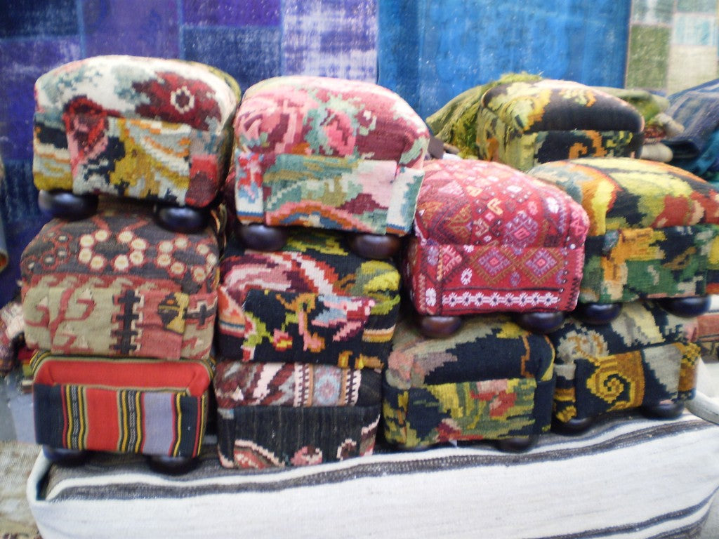
 Tribal-inspired ottomans at Patrick Charles
Tribal patterns like suzanis and ikats have been ultra-popular these past few years in the design world. These funky tribal fabrics made more than one appearance at the gift show, proving it is a trend that is here to stay…at least for a while longer!
 Trending at Manglam Arts
Pretty Pales
 Muted, softer tones are proving to be this fall’s new neutrals. In place of the grays and taupes that have been ever present the past few years, are soft pinks, greens, blues and yellows. Not quite pastel, these white-washed shades add a subtle level of softness and feminity that their less colorful counterparts can! These hues popped up on vintage-inspired and worn-in furniture at booths including Bramble, where pale green wooden chairs mixed with a washed out blue demi-lune table.
 Muted houndstooth patterns at Mr. Brown
Bold and the Beautiful
 Bold turquoise at Legends of Asia
Although the popularity of pale color schemes was undeniable, bright jewel-tones made their appearance in booths other than Oomph. Booth after booth popped with lime green, magenta and turquoise. At Legends of Asia , a favorite of mine, lacquered blue pottery in ancient Eastern shapes mixed and mingled with classic blue-and-white china.
 A fuscia end table at Carson & Co
Although many other colors and patterns made an appearance, these were the trends that stood out to me, loud and proud. Beautiful jewel-stoned colors, pale color schemes, or ikat patterns, there was something for everyone.
Leave a comment