via Houzz
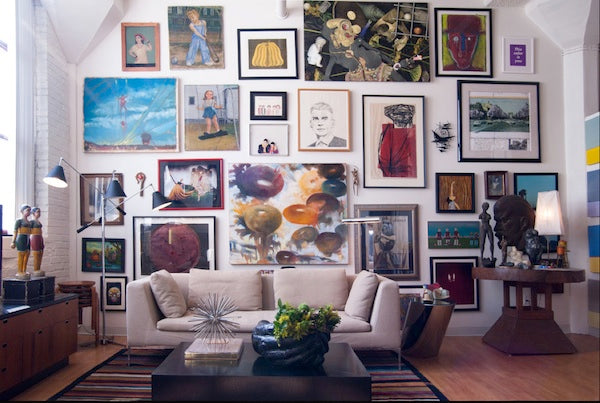
Mix it up
Some people prefer to mismatch things. I say that if that’s your style, embrace it! Do what feels right! On this gallery wall, the shapes, frames, and art all differ. It gives off a chic, eclectic style without looking cluttered or messy.
via Houzz
Transform a space into a room
There are always limits on what you can do in a hallway, but as wall art goes, the sky’s the limit! This added-on-to-over-time gallery wall forces your eye to linger a little longer than if you walked by one or two pieces of wall art. What a fabulous use of space!
via Houzz
Concentrate on shapes
The neural shades of the art and frames make this more of a study of shapes up against this pale wall. There’s something so chic and soothing about this setup!
via Houzz
Create order with continuity
If your space is traditional–and you’d like to keep it that way–go with frames of the same size and matching art. The combo of 15 pieces feel like one when they’re grouped together so nicely in this living room.
via Houzz
So Fabulistas, which gallery wall is your favorite and why? If you noticed, I pulled all of these gorgeous images from Houzz. Visit my Houzz to see lots of my designs and get more decorating ideas!


